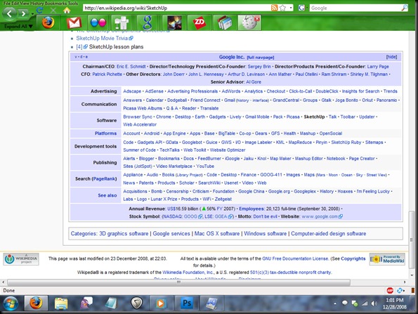
First of all, I was curious as to whether Google Sketchup had a kind of "floor planning" feature that I could use to help my rearrange my basement. It's just plain full of shit and I had a notion to rearrange furniture to make it more livable.
I never actually got to downloading SketchUp because the realization set in that the basement just sucked because it was so full of crap that we just didn't have any other place to put. There are couches - but the only thing that sits on them is boxes of crap.
So for some reason, I click on the Wikipedia entry for SketchUp instead, and I skim through it, and the bottom of the page has one of those Wikipedia Template things that help you navigate other related pages. I really like those templates. The one on this page was for Google, since SketchUp is a Google product now, and it was bolded in the template under Software. (There's also groups of pages under Advertising, Communication, Platforms, Search, and so on - really a lot of products.) At the bottom of the template is even their annual revenue, stock symbol, their motto, employee count. At the top is a list of directors and other notable people in the company.
My point here is, the damn things are cool. But I'm getting distracted. I'll save that for later.
Ah, surfing the web, and having new tab syndrome.
If only I could star that tab, like in Gmail. I would star it Red or something, as you could when they added Gmail Labs and all the star options. Ah well. Hopefully the tab name will help me remember I was looking at a tree of Google's subsystems. No, wait, it says SketchUp. I'll probably forget.
I search for "star a tab firefox" just to check and see if nobody already made the extension. Nope. No results. Did you mean: "start a tab firefox"? Google asks.
The Wikipedia logo IS nice, though. It kinda looks like shit with Colorful Tabs on, though. The white background makes it very squarish. Well, it could be transparent. Google's new small "g" favicon has a transparent background, there. Favicons should really be more well designed.
No. Wait a second.
Web browsers need to recognize favicons larger than 16x16 pixels! That is NOT much room to work with.
Then I looked at my Windows 7 Taskbar.
What if favicons were like 48x48, and ... wait a second ... what if the browser grouped subpages of a site together like the new taskbar does?
I mean, my tab bar is a total mess. It's a mess right now. There are arrows leading to tabs on either side of what's visible. In the past I've even had multiple rows of tabs on.
I think the tab bar needs an overhaul. Time for some quick and dirty Photoshopping.
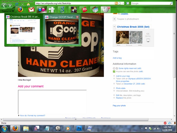
Okay, I obviously got a little distracted because I intended the proof of concept to show thumbnails for that Wikipedia Template. But I digress. Take a look and please try to ignore just how much it looks like the Win7 Taskbar since I pretty much just copy/pasted/edited.
Funnily enough, the entire Firefox interface is definitely smaller than it is now, which means more viewing room. I realize my concept is a LITTLE cramped, but still.
Mostly because in my concept a lot of the empty space is condensed, but really, what’s the point of empty space anyway? I think the CS4 interface for Photoshop and some of the other updated programs is a proof of concept of that, but I’ll talk about that later…
I realize that this is a blatant copy of the Windows 7 taskbar and I didn’t really develop an original interface. (Too bad Windows isn’t open source.) But I think there’s DEFINITELY room for browser tab bar improvements. For many of us, tabs are just plain getting out of hand, moreso than taskbar items. And a lot of the same behavior that the Win7 taskbar introduces would work well, I think. Including pinning items to the bar (ie. Gmail in the example.) Heck – maybe even Jump Lists would work well for some sites – maybe every time you starred a page it would be akin to ‘pinning’ it to a list. This might work well for items at Amazon, Youtube videos, etc etc.
Also, you can see that in my Flickr example, the actual image is represented in the thumbnail preview. I mean, why not?
An Expand All button would display all pages in the main browser window.
I also don’t see why there couldn’t be a hover behavior that previews pages, just like with the Windows 7 Taskbar…. maybe I should be pitching this to Microsoft as an update to IE????????
One issue is the multitude of pages that don’t even have favicons. But there’s no point in worrying about that right now.
Anyway, if anyone’s interested, I’ll gladly do more mockups, but I really don’t think anyone reads this thing. If you like, Digg it.


2 comments:
Oh... my... god... this is terrible. I just hope to god no-one sees this and actually uses it. Everything is compressed into the top left.
And what the fuck is up with that ridiculous staggered line under the navigation controls. I hope that you never, ever end up in control of any project because you clearly expect everyone to have the fine motor control and vision of a 16 year old, and every monitor to be 72 dpi.
I'm only 38 and I can't imagine using such a cluttered interface with so much shit packed into about 128x256 pixels... you need to start losing your assumptions pronto or you'll never progress in UI design.
Your design skils suck shit.
I like it... if you would make a skin out of this concept, I would definetly download it.
Post a Comment