Monday, December 29, 2008

Web Site Jump Lists

Expanding on my “Super Tab Bar”, I’ve made some mockups of how Jump Lists (here called Shortcut Lists) would work.  By right-clicking on the favicon, the jump list comes up.

The beauty of them is that they’re fully configurable.

Intrinsically all web sites can display a list of starred/bookmarked pages, as well as recent pages (maybe this one should be off by default).  It should also be able to detect as RSS feed for a site and display that, too.

But like in the Digg.com example below, sites should also be able to program to their benefit.  This can be tailored to user accounts, as in listing pages dugg or submitted, and friends’ activity.  It could also merely be used to display feed-type material but perhaps tailored for the jump list.  That would of course require no log-in.

One could take this farther and create mini-extensions.  I’m thinking there’s already a Weather type applet that does this in IE8, but I might be mistaken.  Something like that would work well.

Other site-specific ideas I have include favorites on Youtube, Flickr, even SuicideGirls.  eMusic could display your most recent downloads or new arrivals.  Netflix could suggest movies for you and display your queue.  Gmail could show inbox entries.  A calendar application could be very useful.

It might even be possible to use some kind of infrastructure that allows the porting of widgets like those found on Netvibes and iGoogle.

The Big Edit 3 - Jump Lists

The Big Edit 4 - Editing Jump Lists

I realize how WIndows 7 inspired this all is, but it’s just too damn fun to think about.

Sunday, December 28, 2008

Firefox 4 Concept (AKA Tab Bar Overhaul)

First of all, I was curious as to whether Google Sketchup had a kind of "floor planning" feature that I could use to help my rearrange my basement.  It's just plain full of shit and I had a notion to rearrange furniture to make it more livable.

I never actually got to downloading SketchUp because the realization set in that the basement just sucked because it was so full of crap that we just didn't have any other place to put.  There are couches - but the only thing that sits on them is boxes of crap.

So for some reason, I click on the Wikipedia entry for SketchUp instead, and I skim through it, and the bottom of the page has one of those Wikipedia Template things that help you navigate other related pages.  I really like those templates.  The one on this page was for Google, since SketchUp is a Google product now, and it was bolded in the template under Software.  (There's also groups of pages under Advertising, Communication, Platforms, Search, and so on - really a lot of products.) At the bottom of the template is even their annual revenue, stock symbol, their motto, employee count.  At the top is a list of directors and other notable people in the company.

My point here is, the damn things are cool.  But I'm getting distracted.  I'll save that for later.

Ah, surfing the web, and having new tab syndrome.

If only I could star that tab, like in Gmail.  I would star it Red or something, as you could when they added Gmail Labs and all the star options.  Ah well.  Hopefully the tab name will help me remember I was looking at a tree of Google's subsystems.  No, wait, it says SketchUp.  I'll probably forget.

I search for "star a tab firefox" just to check and see if nobody already made the extension.  Nope.  No results.  Did you mean: "start a tab firefox"? Google asks.

The Wikipedia logo IS nice, though.  It kinda looks like shit with Colorful Tabs on, though.  The white background makes it very squarish.  Well, it could be transparent.  Google's new small "g" favicon has a transparent background, there.  Favicons should really be more well designed. 

No.  Wait a second.

Web browsers need to recognize favicons larger than 16x16 pixels!  That is NOT much room to work with.

Then I looked at my Windows 7 Taskbar.

What if favicons were like 48x48, and ... wait a second ... what if the browser grouped subpages of a site together like the new taskbar does?

I mean, my tab bar is a total mess.  It's a mess right now.  There are arrows leading to tabs on either side of what's visible.  In the past I've even had multiple rows of tabs on.

tabbarmess

I think the tab bar needs an overhaul.  Time for some quick and dirty Photoshopping.

Okay, I obviously got a little distracted because I intended the proof of concept to show thumbnails for that Wikipedia Template.  But I digress.  Take a look and please try to ignore just how much it looks like the Win7 Taskbar since I pretty much just copy/pasted/edited.

The Big Edit 

 The Big Edit 2 - Flickr Preview

Funnily enough, the entire Firefox interface is definitely smaller than it is now, which means more viewing room.  I realize my concept is a LITTLE cramped, but still.

Size

Mostly because in my concept a lot of the empty space is condensed, but really, what’s the point of empty space anyway?  I think the CS4 interface for Photoshop and some of the other updated programs is a proof of concept of that, but I’ll talk about that later…

I realize that this is a blatant copy of the Windows 7 taskbar and I didn’t really develop an original interface.  (Too bad Windows isn’t open source.) But I think there’s DEFINITELY room for browser tab bar improvements.  For many of us, tabs are just plain getting out of hand, moreso than taskbar items.  And a lot of the same behavior that the Win7 taskbar introduces would work well, I think.  Including pinning items to the bar (ie. Gmail in the example.)  Heck – maybe even Jump Lists would work well for some sites – maybe every time you starred a page it would be akin to ‘pinning’ it to a list.  This might work well for items at Amazon, Youtube videos, etc etc.

Also, you can see that in my Flickr example, the actual image is represented in the thumbnail preview.  I mean, why not?

An Expand All button would display all pages in the main browser window.

I also don’t see why there couldn’t be a hover behavior that previews pages, just like with the Windows 7 Taskbar…. maybe I should be pitching this to Microsoft as an update to IE????????

One issue is the multitude of pages that don’t even have favicons.  But there’s no point in worrying about that right now.

Anyway, if anyone’s interested, I’ll gladly do more mockups, but I really don’t think anyone reads this thing.  If you like, Digg it.

Wednesday, December 17, 2008

Holy Windows 7, Microsoft.

Yes, I know I’ve been excited about Linux lately, but Microsoft’s endeavors in the OS world have always been something that, at the very least, gives me something to talk about.

With Vista, my talking was more like, “All right – they haven’t really changed very much from XP!”

So I hoped that history wouldn’t repeat itself.  I hoped that they would come up with some creative solution to solve taskbar clutter, a better way of implementing folder bookmarks, and maybe a more customizable tool tray on the taskbar.

It’s like they were reading my mind because the Windows 7 interface now looks like this:

windows7

Just look at how many applications are running there! And you can still clearly see what each one is! In fact, some are conveniently grouped together!

I realize that some will or already are claiming that the new taskbar is a direct ripoff of Mac OSX’s dock.  Yes, I recognize that programs are now represented by a large icon, and programs can be pinned there permanently, and you can re-order them to your liking.  These things are all dock-like.  On the other hand, the basic behavior of the thing is essentially unchanged – if you open a program from the Start menu, it will have a button on the taskbar, and when you close it, that button will go away.  Is it inspired? Maybe. Is it a huge improvement? Undoubtedly.

But it goes above and beyond.  I have always taken issue with managing multiple windows on the OSX dock.  Just because I feel like a proving a point, take a look at the way it manages minimized windows:

macosx

Um, not anywhere near their main dock icons – in fact completely off to the right – and in total disarray, with no real way to differentiate one, say, Firefox window from another.  Okay.  I’m just bitter about Apple fans being on their high horses.  I’m done.

But really, take a look at what happens when you have multiple, oh, Pidgin IM conversations open in Windows 7.

taskbarmultiple

Wow! When you hover over the Pidgin icon, which looks a little “stacked” to indicate there are multiple windows, you get to see all three.  And if you hover over a specific one:

win7peek

-- all other windows will go transparent, save for their outlines.  You might think this is just eye candy, but think about this in terms of the live thumbnails that were introduced in Vista.  They were dumb.  They were too small to see.  Here, they’re a little bigger, but still too small to see many striking differences.  But now, hovering over the thumbnail gives you a literally full size preview of the window, and your eye is conveniently drawn to it.  This feature is called “Aero Peek”, I think… and it’s really nice!

Bah! Windows XP had grouping, you say.  Sure it did.  And it looked like this:

taskbarIEtabs2

And personally, I always turned it off.  (Yes, this screenshot is obviously from Windows 7.  I wondered what would happen if too many windows were open.  Although in this case, for internet explorer, every tab is listed… not window.  I don’t really know why.  It seems counterintuitive to the point of tabs.  Firefox, thankfully, does not do this, although the Downloads and Add-ons windows ARE conveniently grouped with your browser window.  Those two bastards caused a lot of unnecessary clutter.)

taskbarIEtabs
If I used IE, it would always look like this. 

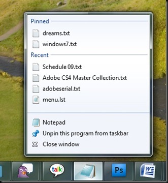
Another fucking great feature is Jump Lists.  If you right-click a taskbar icon, a little guy like this comes up:
jumplists2

You get a list of recently opened files as well as files you’ve pinned to have available at your fingertips.

THIS IS AWESOME.
AND IT WORKS FOR EVERY PROGRAM.
THIS IS SERIOUSLY AWESOME.

Some programs also have tasks, like Windows Media Player has options like “Play All Music Shuffled” and “Resume Last Playlist.” The only thing that kind of sucks is that it isn’t clear how to customize any tasks for other programs.  For example, Winamp has no tasks yet.  Hopefully this can be remedied in the near future.

By the way, Windows Media Player also has a cool, different live thumbnail:

taskbarwmp

Skip and pause buttons! Cool!  And functional!

Jump Lists are also present in the Start Menu.  The right side of the menu changes when you hover over the corresponding arrow:

jumplists1

Seems like a good idea to me.

One more thing concerning taskbar icons.  One window that always bugged me because it took up space was the “file transfer” dialog, especially during long transfers.  Now, those dialogs are grouped with other Explorer windows, and actually, the icon’s background itself gradually turns green, indicating transfer progress.  Nice touch.

taskbarfiletransfer

The tool-tray, or whatever you call it, also gets a revamp.  Not only are icons equally spaced, you now have the power to easily reorder them or get rid of them completely.  Clicking the arrow brings up a little box that hides the other guys, and you can drag and drop to your delight.

tooltray

Notifications are also handled more gracefully, as most windows messages are relegated to the new Action Center, which on clicking, does something like this:

actioncenter

Yes, I can dig it.  It also helps that User Account Control (UAC) can be fine-tuned to be a little less nagging in asking for your permission to install programs.  I still find it too annoying to be anything but OFF, but at least little icons let me know when I’m doing important things:

font

And in case you were wondering, that is in fact an install button for a font.  I had no idea why I didn’t seem to be able to drag and drop fonts into the Fonts folder… until I noticed that button.  You don’t even have to unzip them.  What a convenience!

Microsoft is continually messing with the idea of Virtual Folders, but now they’re called Libraries, and I think they have some potential.  Basically you assign any number of folders to a library, and you can sort all of the folders in various ways.  I found it useful to make one for my school folders:

libraryschool

And then you can narrow things down by Type, like I can look at all of the ODFs I have in all of those folders at once:

libraryODFs

I actually think they’re on to something – there are some practical uses for this, but it’s admittedly hard to find them.  There are multiple types of Libraries, and if it’s a “Picture” library and not a “Generic” one, the option to sort by types like ODFs doesn’t seem to exist.  If you change your pictures Library to a Generic Library, though, you can then look at all 6,000 of your JPGs at once, which is kind of neat.

Libraries: a little confusing and need some polish, for sure.

Okay, one more thing with this long-ass post:

win7paint

New version of Paint.  Jesus Christ.  It even has a ribbon.

Tuesday, December 16, 2008

Windows 7

I got my paws on a pre-beta, so you fools (all none of you who read this) better look out, there's gonna be some major posting very soon.

Tuesday, August 19, 2008

Linux Orpdort!!

That's 'update' in Coach Z speak.

So, it's been quite a while since my last post. The good news is I haven't booted into Windows once since that post. As I discovered the other day, I apparently mucked up the boot manager when I did install ubuntu - so I couldn't have, at least until I fix that, anyway. Ha.

The other good news is that I love it. Really, I do. I didn't discover my Windows install was incapacitated until very recently because I didn't have any desire to boot into Windows at all.

So why DID I?

Well, games. Yeah, games. On the bright side, it was only 'cause I couldn't figure out how to get TeamSpeak to work, and Steam was acting just a little funky (the chat wasn't working quite right, and I was trying to join a group of friend's game in TF2.) And Team Fortress 2 actually does work flawlessly, assuming you add -dxlevel 81 to the game's launch properties. Likewise for Half-Life 2 and its episodes. That's a big plus because they're really the only games I tend to have a hankering to play (or replay as it were). Unfortunately, some day I'm going to want to actually finish BioShock, and replay Crysis... but that day will not be today, at least not without getting Windows up and running.

Amarok is great. It was crashing on me often at the start, but after changing the audio engine to xine it's been solid as a rock. I think I like it better than Winamp, although Winamp's AlbumList addon trumps the Amarok cover manager in many ways. The Amarok 2 nightly right now is awfully buggy and still missing a lot of features, but maybe a solution will crop up. Either way - no big deal.

I love the gnome-panel. I love how you can customize it to your heart's content. Task manager not where you want? Move it. System tray? Move it. Clock? Volume? You get the picture. The main menu is completely configurable, and it's terribly easy to add launchers to commonly used apps. But the best part are the apps you can add, super easily. Tomboy Notes is my favorite notepad-esque app ever. Glipper keeps a convenient drop-down of your copy/paste history. Phases of the Moon? Aww yeah. CPU stress indicator is handy, but the netspeed one lets me keep an eye on exactly how much data is going in and out of this machine, which is just plain invaluable.

Conky's real cool. I know a lot of people have it visible at all times, but I like to keep it in a compiz widget layer. Easily checked by tapping F9!

Flash support is decent. It varies. Sometimes Youtube vids play great, other times they look full of crappy artifacts or refuse to play. If you're scrolling down a page and there's an embedded vid, sometimes scrolling halts or gets real chunky.

Alas, there is Virtualbox. This is a whole 'nother article in itself. The idea is you install a new copy of Windows inside of your installation, and it works surprisingly well. I installed a (semi-hacked) copy of XP, and it runs as fast as any install of Windows I've ever used. Once you install the Virtualbox Guest Additions, you're able to access all of your folders as you normally would. And with the "Seamless" mode, it expands Windows to fill the entire screen, but lets you mix Windows windows with Linux windows! Just plain AWESOME. It works great on your second desktop.

Here's a short little video demonstrating it:


Half the time I keep Firefox running just because flash support trumps that of native linux. And for some reason I have terrible luck getting ANY of the eMusic.com download managers to work in linux, so I use the Windows version still.

Photoshop works quite well. So do most of the CS3 apps (Photoshop CS3 doesn't work in Wine, though CS2 does). I haven't done any REAL heavy lifting with Premiere Pro, but I had no problem splicing together some 300+mb clips and encoding the thing. (I do wonder what the encoding time would be like in a "real" windows install vs. the virtual one.)

It's a little questionable having only 2 gigs of RAM and having the virtualbox on quite often (as you can gather from the conky screenshot), but if I had 4 gigs I would have no qualms at all.

So, just a quick and dirty update. I don't know if anyone has even ever read this blog, but I guess I'll continue to (sporadically) keep it updated with my linux adventures and other GUI stuff that I've been neglecting.

PS. Compiz is AWESOME. Love the Domino effect, especially for opening windows.

PPS. Never really got those 1.1MB/s speeds much after the first few days of using ubuntu. I have NO idea where those came from.

Thursday, July 3, 2008

Ubuntu Thoughts (plus Photoshop CS2 on Wine!)

So, I've gone Linux.

Well, it's not my first time. Nor can I truly predict at this point whether it's safe to say I'm done with Windows, but at least for this summer, my goal is to not have to boot into Vista for any reason.

So far, so good.

Technically, I've installed Ubuntu Studio, a sorta sister distro of Ubuntu. It's based on the latest 8.04 release, which I admit I DID try to install, but after continual mishaps with the Live CD installer, Ubuntu Studio's installer worked on the first try and has a few nice perks so I see no reason to ditch it.


My hardware often clashed with Linux. I've had network issues, with some ethernet cards (often onboard ports) not working at all. I've had sound issues, which took me a LONG time to figure out (turned out the ALSA mixer had an extra channel full of fuzz turned up the whole way). I've had graphics card issues, especially with my X800, and having to manually configure X after installing. Mounting hard drives was the worst - I've been specifically putting all my files and media on a separate partition for both windows and linux to access, but it was always a supreme pain to mount them and have to keep 'em in fat32.

And on the software side of things, Firefox 2 always seemed sluggish, Flash was a bitch, GAIM left me wanting more, and installing programs just confused me. And fonts looked nasty.

But it's been a few years since I've done more than just muck about with live CDs - I built a FreeBSD/XFCE desktop from the ground up back in maybe '05, and that was about as far as I went.

It probably helps that I recently (around christmas) put together a brand new system, with a Gigabyte mobo, Core 2 Duo chip, 8800GT, 2 gigs ram, sata hard drives, and so on. But the installation was the cleanest ever. In fact, all those niggling issues I had in the past were essentially GONE. With absolutely no extra steps, my sound worked perfect, I connected to the net instantly (and strangely, a lot faster than in Windows), my partitions (NTFS, now) were detected instantly and mounted painlessly, my graphics card displayed the best resolution even before downloading proprietary drivers (again, straightforward, too!)....... remarkable.


Pidgin (previously GAIM) has become my IM client of choice over the years, so I welcome it, and Firefox 3 works as brilliantly on Linux as it does on Windows. Flash actually works, too!!! Amarok is an easy transition from WinAmp and its cover manager is solid compared to winamp's AlbumList. After installing some TTF fonts, everything is looking sharp. VLC is working better than ever, Google Earth is available, Hamachi seems to work ... and of course my favorite notepad app, Tomboy Notes, is there. I really love the customization potential of the gnome panel.

Oh, and Compiz is awesome. Wiggly windows!

Installing programs via Add/Remove and Synaptic is ten times better than searching out programs on the web and its library is quite expansive. Even Wine-Doors, a gui installer for wine, can download certain programs. I used it to download Photoshop CS2, after reading various blog posts about the general not-working-ness of CS3, and was surprised to see it ACTUALLY DOWNLOAD IT. Sans keygen of course, but still cool.


I also tried to install Steam. Download speeds were insane. I never get more than 200 KB/s on this connection - at least in Windows - and all of a sudden Team Fortress 2 is downloading at not 200, not 500, not 900, but 1.1 MB/s!!! WHAT?! ... Awesome.

Well, I haven't really ironed out the bugs with TF2. It sort of runs, albeit with all the HUD blacked out, and it seems to crash when I change the textures from Low quality to, well, anything else. Still, a good start.

Photoshop CS2 crashed the first few times I tried to run it but after a restart it seems to work quite well. Performance seems good. Mouse control might not be QUITE as smooth as it is natively, but still good enough I could draw this bear. The filter gallery works fine as well.


So, I'll keep you updated. Next on my list of things-to-do is get VMWare or something up and running so I can edit video in Premiere CS3. I'd also love for Soundbooth to work.

Thursday, May 1, 2008

New Windows UI in the works?

Mark Hamburg, who has been working on Adobe's Photoshop since 1990 until he decided to create Adobe's Lightroom, has apparently been hired to work on "user experience" for Microsoft Windows.

"Given that I find the current Windows experience really annoying and yet I keep having to deal with it, this opportunity was a little too interesting to turn down. I can't imagine doing serious imaging anywhere other than Adobe, but I needed to do something other than imaging for a while."

[b]I[/b] think it's about time we saw some major innovations in desktop UI.

News
Photo Blog of Mark leaving Adobe

Blog Archive